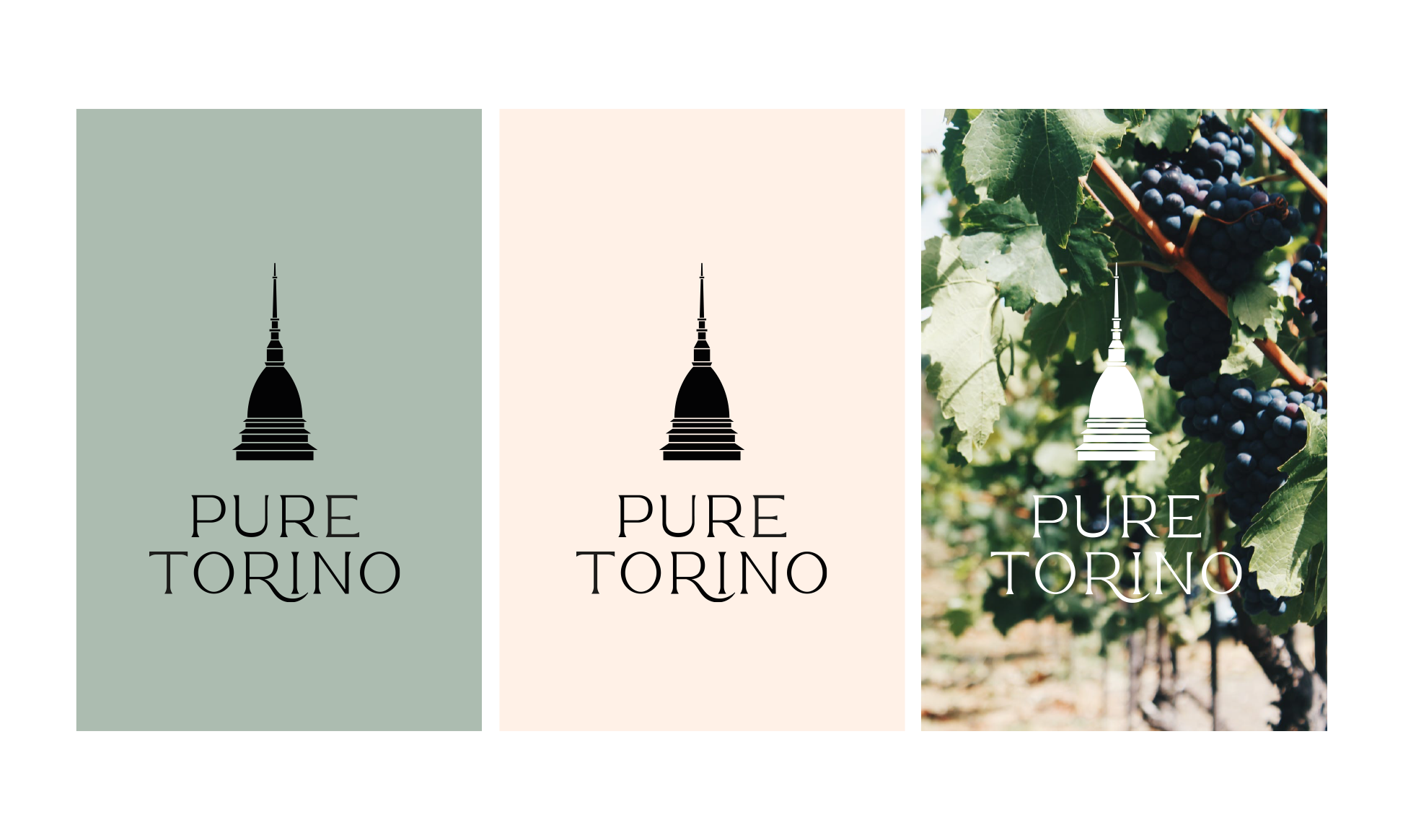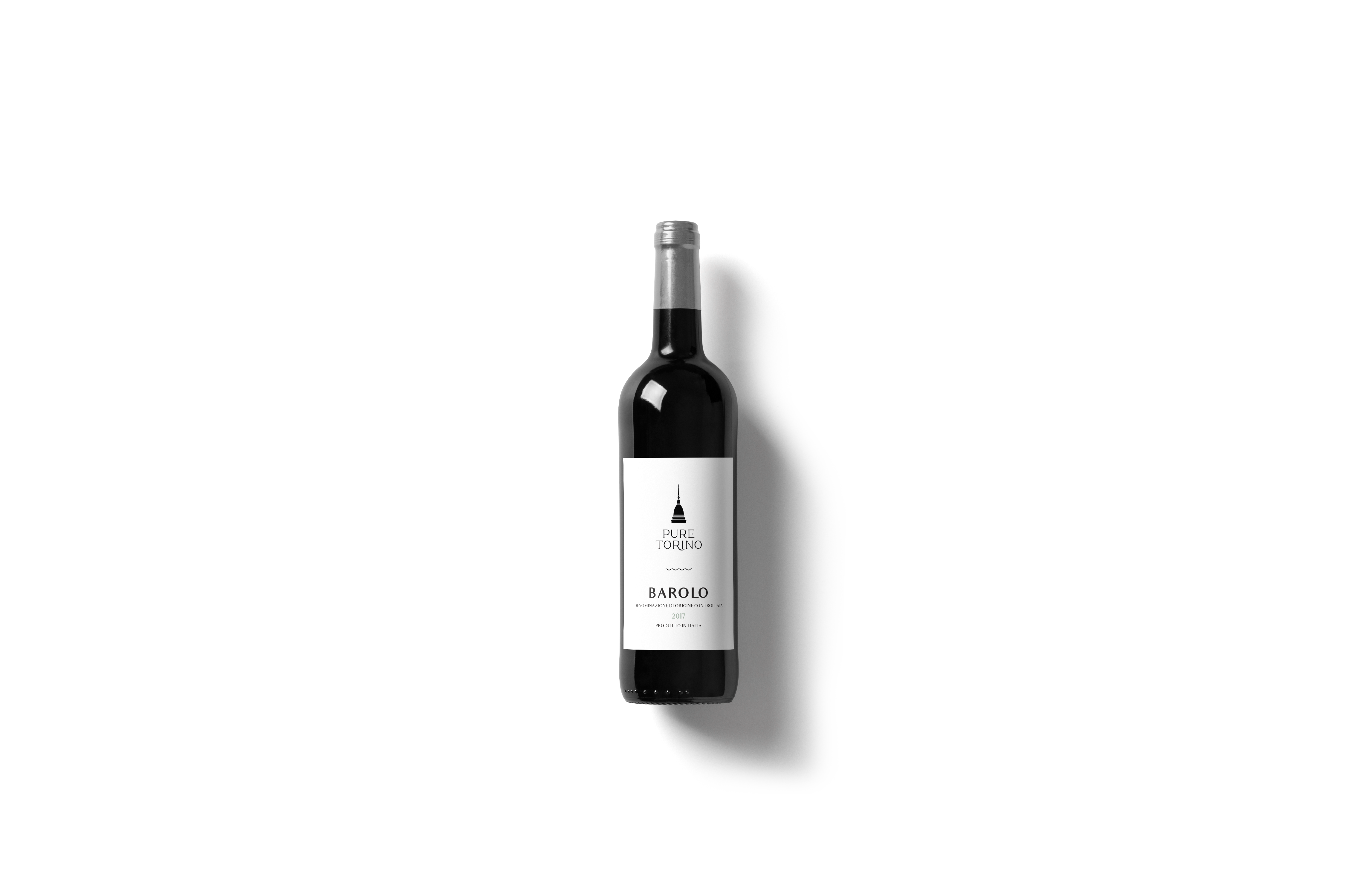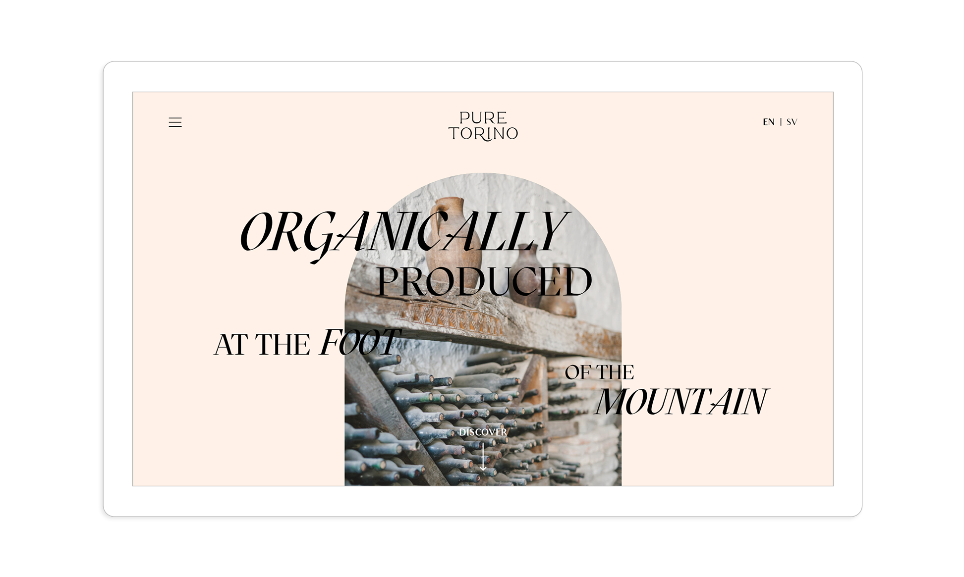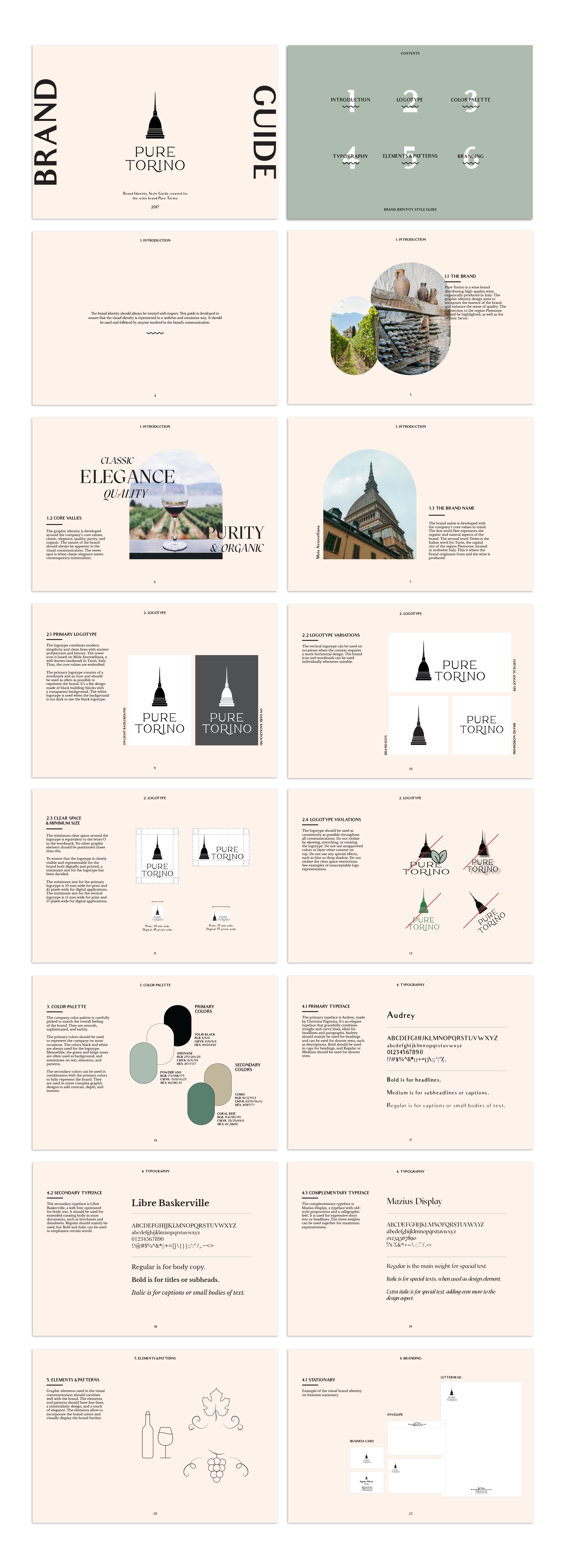

Pure Torino is a brand concept for an Italian wine producer. The brief was to develop both concept and design to help establish the product on the Swedish market. The brand identity was developed around the brand’s keywords; organic, quality, purity, classic, and elegance. The brand name was chosen to represent the organic and natural aspects of the brand (pure) and highlight the city where the brand originates from (Torino, Italy). The logotype combines modern simplicity with historic architecture, designed to express sophistication yet feel clean and modern. The tower icon is based on Mole Antonelliana, a well-known landmark in Turin. Thus, connecting the brand to the roots and enhancing the recognition and sense of quality.


